
Translation Evaluation Impact Analysis
Measuring what an accessibility-led redesign of Hand Talk's evaluation screen actually changed. Evaluations rose 93.30%, and they rose while the audience shrank.
Project overview
- Company
- Hand Talk
- Date
- May – July 2022
- Scope of work
- UX Research
- Accessibility
- Data Analysis
- My role
- UX Researcher & Strategist
- Collaborated with
- UX Design team
- Product team
- Development team
About Hand Talk
Hand Talk is an award-winning accessibility platform that uses AI to translate digital content into sign language through virtual avatars. In Brazil the plugin translates web content into Libras, the Brazilian Sign Language, through a 3D interpreter, so that deaf and hard-of-hearing users can navigate a site more independently.
Context and challenge
In June 2022 the design team shipped a major redesign of the translation evaluation interface, built around accessibility and universal design principles. The previous interface leaned heavily on iconography with no textual context, which created barriers for users with different cognitive and visual abilities.
The evaluation itself is not a minor screen. It is the only place the product asks users whether a translation was any good, and that answer feeds the machine learning model behind the translations. Friction there does not just cost feedback, it slows the product down.
My job was to find out whether the redesign worked, and to do it well enough that the answer could inform the next decision rather than just decorate a retrospective.
User journey to evaluation
The evaluation screen appears at a specific moment:
- A user visits a website with the Hand Talk plugin installed
- They select the text they want translated
- Hugo, the 3D avatar, performs the translation in Libras
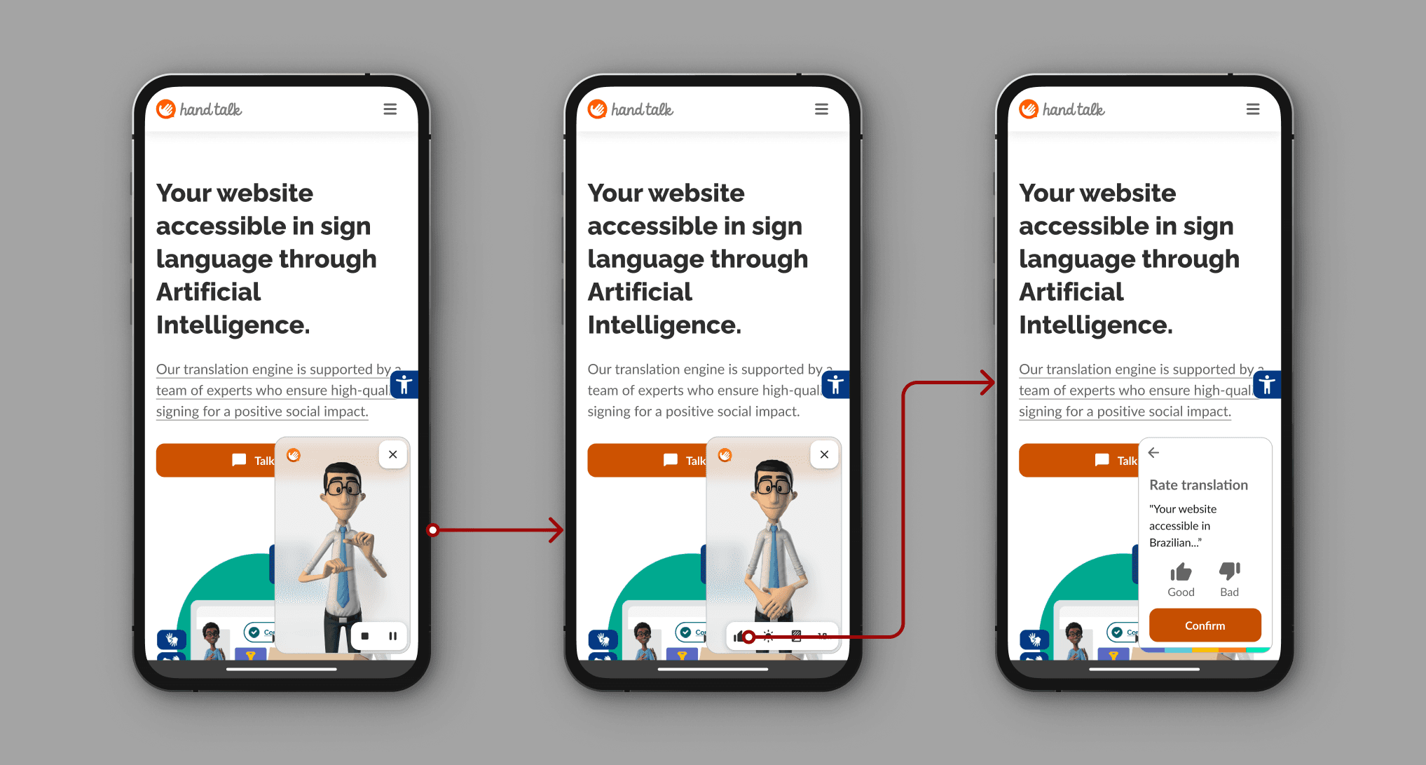
- The evaluation prompt appears, asking them to rate the translation
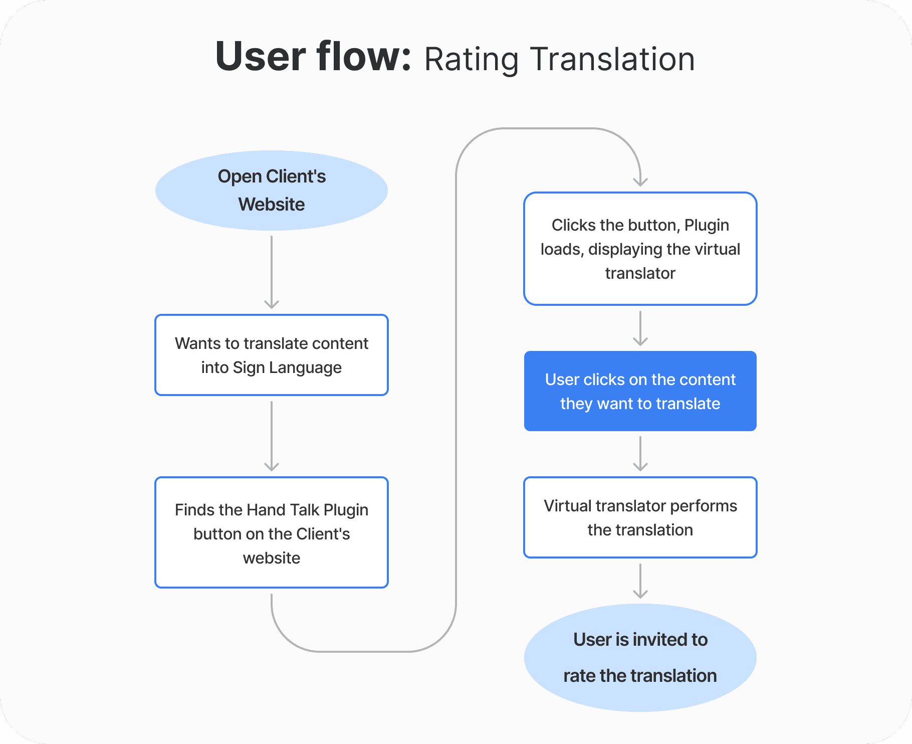
What the design team changed
The redesign addressed three barriers, each with a specific component change.
1. The rating buttons
Before
- Icon-only thumbs, with no text label
- Grayscale, so the selected state only darkened slightly
- No clear indication of which option was active
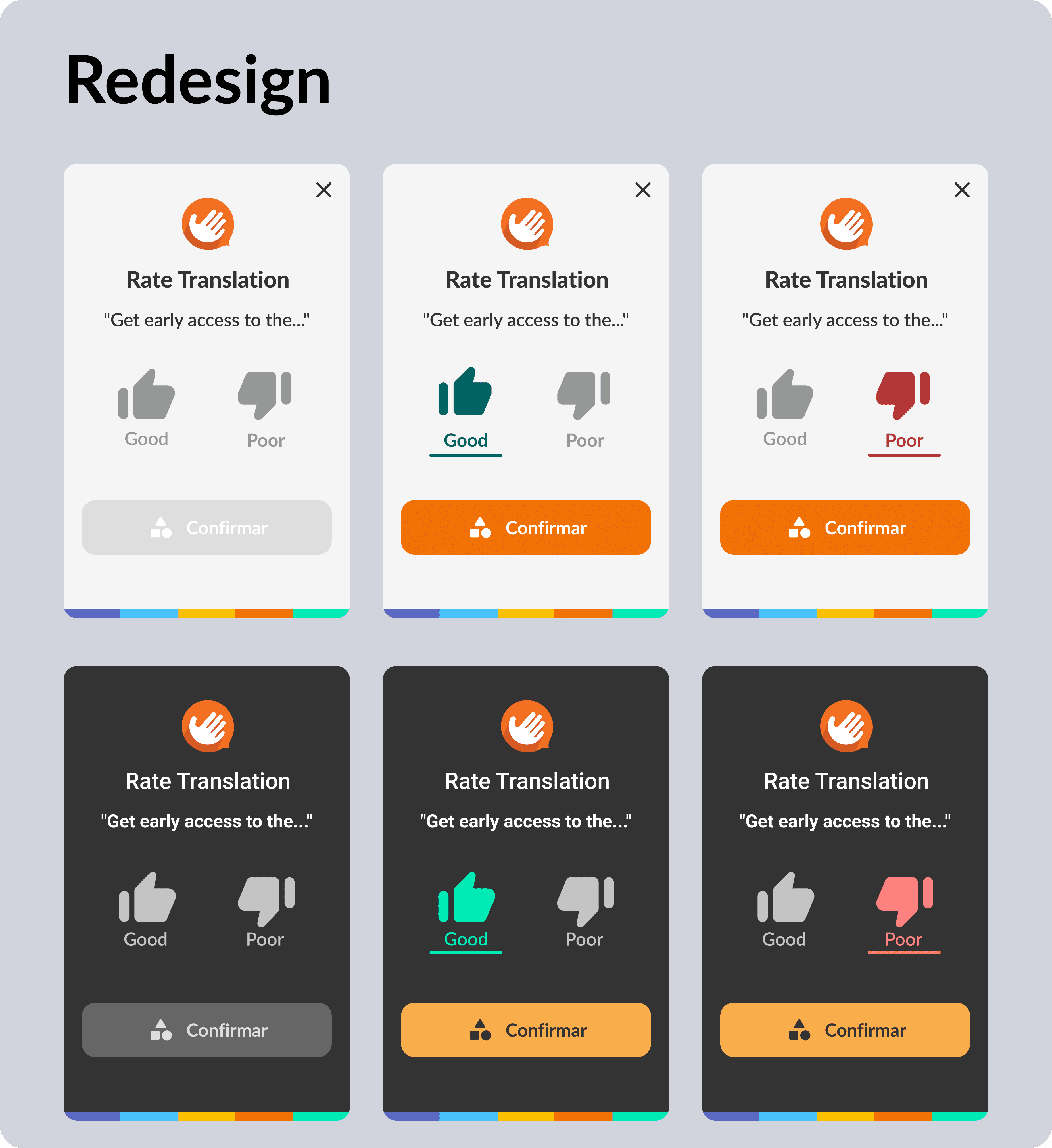
After
- Text labels: Good and Bad
- Meaningful colour: green for positive, red for negative
- An underline on the selected state
The underline is the part worth dwelling on. Colour alone fails WCAG 1.4.1 Use of Color (opens in a new tab): a user with red-green colour blindness gets no signal from a green thumb versus a red one. The underline carries the same information without depending on hue, so the selected state is unambiguous for everyone.
2. The confirmation button
This was the most interesting failure in the old design.
The old screen used a generic check mark that turned green once a rating was selected. Users read the green check as confirmation that their rating had been sent. It had not been. The click was still required, and many people closed the plugin believing they were done.
The redesign replaced it with a full Confirm button from the design system, with the check icon demoted to a supporting element. It stays inactive until a choice is made, so the call to action is unmistakable.
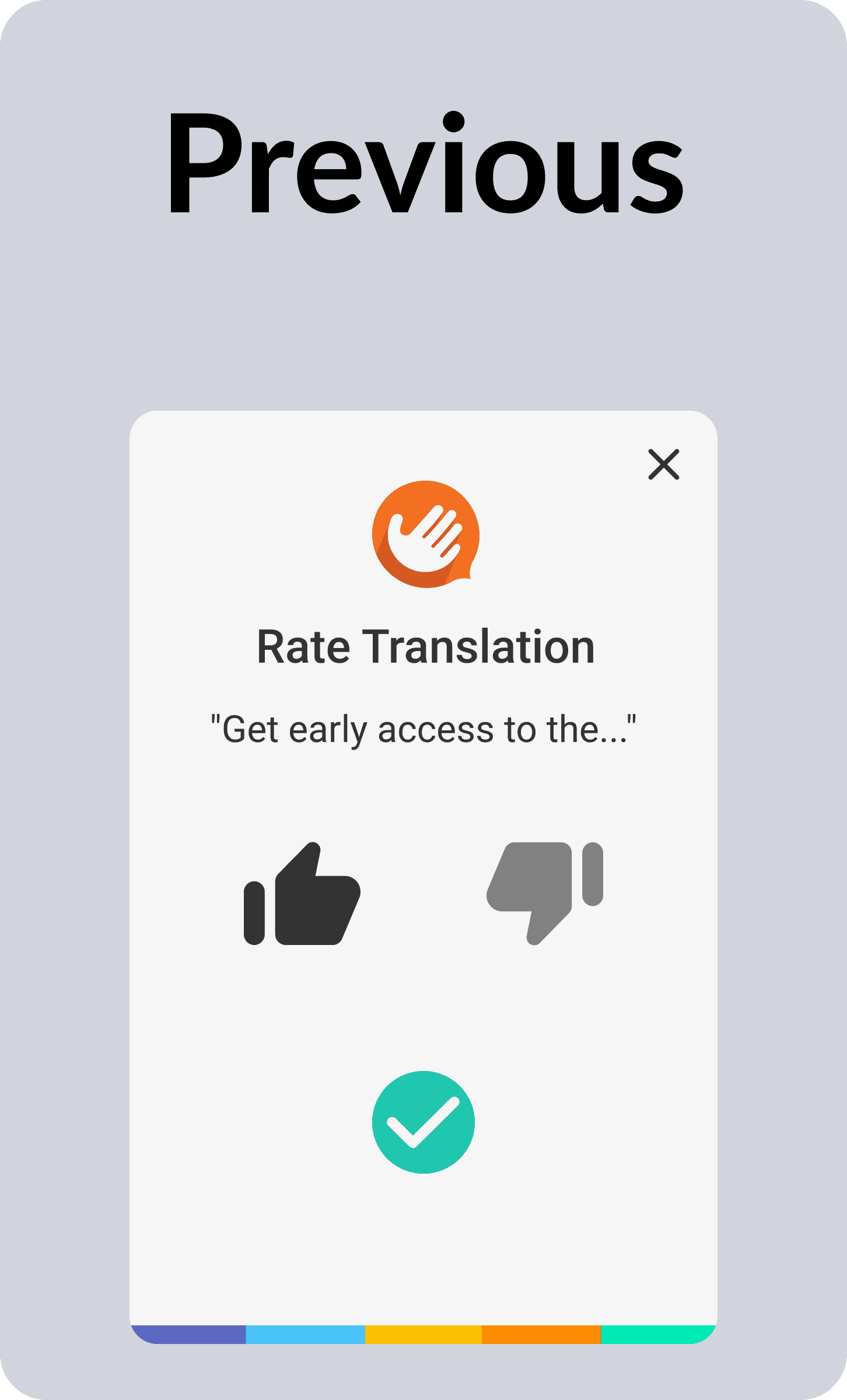
BeforeThumbs with no labels, and a green check that read as “sent” when nothing had been sent.
3. The screen around them
Consistent design system components, better contrast ratios, screen reader compatibility fixes, and clearer interaction affordances throughout.
Methodology
I designed a pre/post comparison with controlled windows, so the design change was the thing being measured rather than seasonality or a release coinciding with something else.
| Window | Dates | Length |
|---|---|---|
| Before | May 8 to June 7, 2022 | 30 days |
| Buffer (rollout) | June 8 to 9, 2022 | 2 days |
| After | June 9 to July 9, 2022 | 30 days |
Metrics selected:
- Volume: total and unique evaluation events
- Quality: average translation rating, on a 0 to 1 scale
- Behavioral: session patterns and user journey analysis
- Engagement: evaluation completion rates
Tooling was Google Analytics with custom event configuration for the evaluation flow, session-sequence analysis for multi-session behaviour, and percentage-change comparison across the two windows.
Results
+93.30%
Evaluations: 597 to 1,154, a net gain of 557
+10.95%
Average rating: 0.82 to 0.91 on a 1.0 scale
−11.71%
Users in the same period, against the one before
Higher ratings alongside higher volume suggests users were not only engaging more, they were having better experiences with the translations they rated.
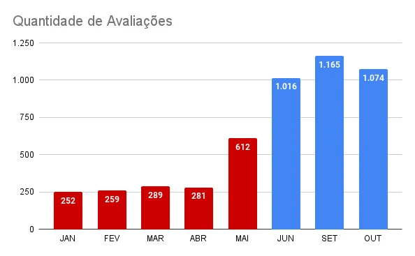
Text description of this chart
The five red bars stay between 252 and 612, rising gently across the first months of 2022. The three blue bars sit far above them, from 1,016 in June to a peak of 1,165 in September and 1,074 in October. The step up at the redesign holds for months rather than fading, so the change was not a launch spike.
The result held while the audience shrank
This is the finding that made the case rather than the headline percentage.
An increase in evaluations is easy to dismiss as an increase in traffic. It was the opposite. Compared with the preceding period, the plugin was reaching fewer people, and the evaluations still nearly doubled.
| Metric | Change | After vs before |
|---|---|---|
| Users | −11.71% | 184,452 vs 208,918 |
| New users | −12.07% | 172,081 vs 195,703 |
| Sessions | −10.48% | 210,099 vs 234,695 |
| Pages per session | +3.51% | 1.17 vs 1.13 |
| Average session duration | +4.43% | 00:00:55 vs 00:00:52 |
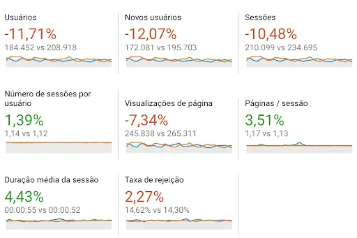
Fewer users, fewer sessions, fewer page views, and 93% more completed evaluations. The redesign was not riding a wave. It was converting a smaller audience far more effectively.
When users evaluate
Session-sequence analysis showed where in a user's history the evaluations fall.
| Session | Share of evaluations | Events |
|---|---|---|
| First session | 73.31% | 846 |
| Second session | 14.82% | 171 |
| Sessions 3 to 105 | 11.87% | 137 |
A separate slice of data illustrates why total and unique counts differ: in one sample period there were 1,107 total events against 943 unique ones, counted per session. A user who rates five translations in a single session registers five total events and one unique one. Users who start evaluating tend to keep going.
Business impact
Engagement nearly doubled, and the higher average rating meant the machine learning model behind the translations received both more feedback and better-quality feedback to train on.
The wider result was a benchmark. The analysis gave the team evidence that accessibility-led design produces measurable outcomes, which made it defensible to apply the same principles to other plugin interfaces and to build the same measurement discipline into future changes rather than shipping and hoping.
Lessons learned
Accessibility is not just the right thing to do, it is good business. Making the evaluation interface more inclusive and contextually clear did not only help users with disabilities. It improved the experience for everyone, and nearly doubled engagement.
Small, precise changes moved the number. Text labels, an underline, and an honest button. No new features, no new screens. The most valuable improvements were the ones that removed friction rather than adding capability.
Measure, or the work goes unnoticed. Without the analytics these improvements might have been overlooked or written off as noise. And without checking the audience numbers, the result would have looked like a traffic story instead of a design one. Data is what turns a design decision from a preference into an argument.
Other projects.
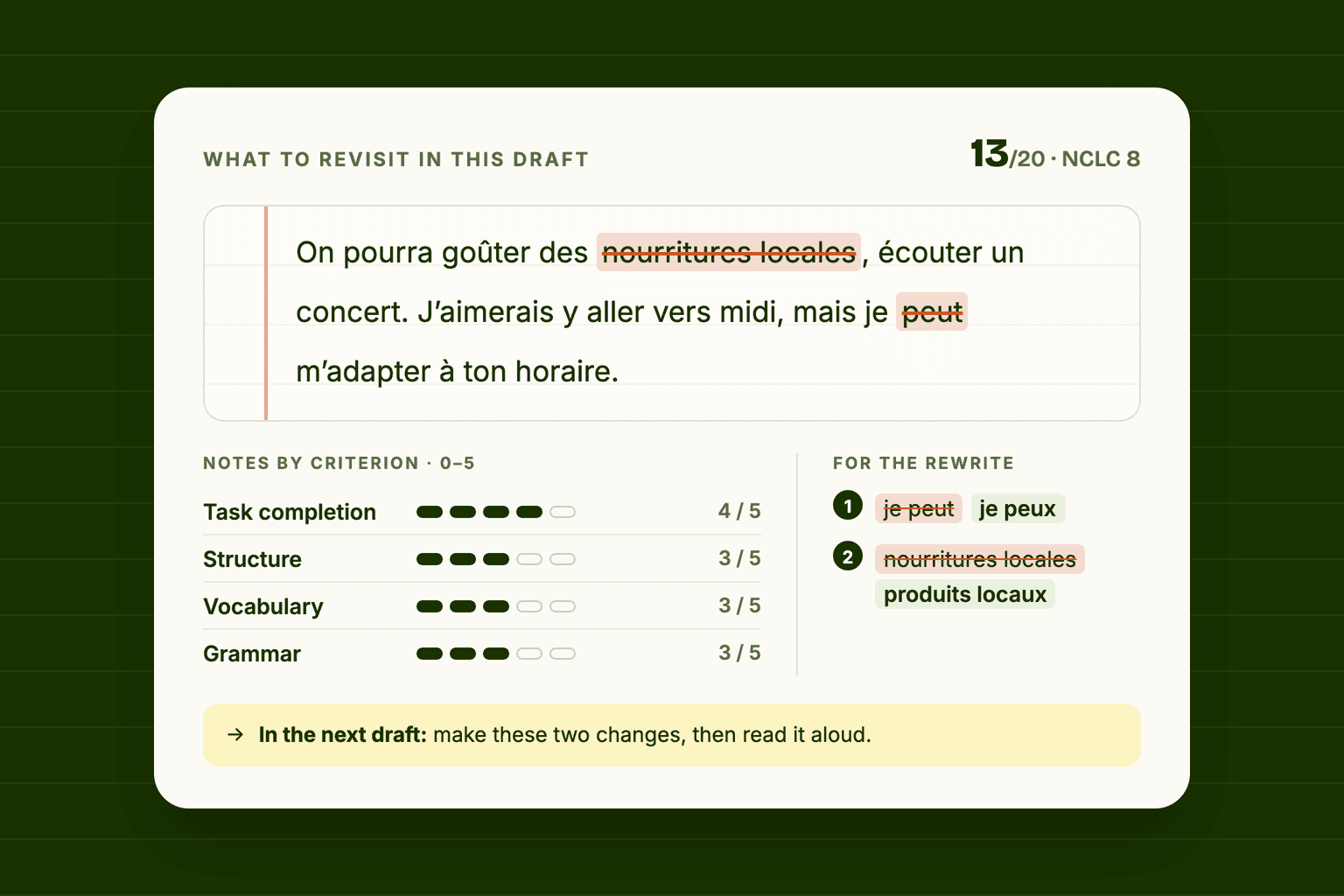
Écrivance · Nov 2025 – Present
Turning AI Feedback Into a Learning Interface
A language model will happily write four paragraphs about your French essay. None of that is a lesson. This is how I turned model output into a scored, prioritised, act-on-it-now page, for an exam I was sitting myself.
293,849 words written and corrected through the interface
- AI Interaction Design
- Product Design
- Design Systems
Hand Talk · Q4 2022
Why 94% of Our Leads Were Wrong
A UX investigation into disqualified leads revealed an unexpected behaviour pattern, and one redirect fixed everything.
94% → 0% disqualified leads from the plugin loading screen
- UX Research
- Behavioral Analysis
- Optimization
Hand Talk · Q3 2023
Accessibility Benchmarking for Product Roadmapping
Mapping 43 features across five competitors and prioritizing what truly matters for users and compliance.
43 features benchmarked into a 7-feature 2024 roadmap
- UX Research
- Accessibility
- Benchmarking

Hand Talk · 2022–2023
Making an Accessibility Product Measurable
Mapping 11 flows and 53 trackable states for an accessibility plugin, and building the measurement layer every later study here runs on.
11 flows mapped into 53 trackable interactions and states
- Product Analytics
- Measurement Design
- User Flows