
Turning AI Feedback Into a Learning Interface
A language model will happily write four paragraphs about your French essay. None of that is a lesson. This is how I turned model output into a scored, prioritised, act-on-it-now page, for an exam I was sitting myself.
Project overview
- Company
- Écrivance
- Date
- Nov 2025 – Present
- Scope of work
- AI Interaction Design
- Product Design
- Design Systems
- My role
- Founder, Product Designer & Engineer
The exam, and why writing is the hard part
The TCF Canada is a proof-of-French exam used for Canadian immigration files. Reading and listening are well served: past papers, drill apps, YouTube. Writing is not, because writing cannot be auto-marked as right or wrong. It is judged by an examiner against four criteria, across three tasks of different length, register and format:
| Task | Format | Length | Time | Level |
|---|---|---|---|---|
| Tâche 1 | Personal message | 60–120 words | 15 min | A2–B1 |
| Tâche 2 | Article or formal letter | 120–150 words | 25 min | B1–B2 |
| Tâche 3 | Argumentative text | 120–180 words | 40 min | B2–C1 |
The candidates I met online were preparing alone. A human tutor gives real, rubric-aligned feedback, but the loop runs in days and costs per hour. With a booked exam date, you do not need better corrections. You need more of them, faster, and you need to know which one to fix first.
The actual design problem
Getting a model to critique French prose is not hard. Getting it to produce something a stressed candidate can use in two minutes is the whole job.
What a model gives you
- Four paragraphs of fluent, hedged commentary
- Praise and criticism in the same sentence
- Errors listed in the order they appear
- No stable scale between one attempt and the next
What a candidate needs
- A score they can compare to last time
- Which of the four criteria is dragging them down
- Which single error to fix first
- One concrete thing to do in the next draft
Every design decision below follows from that gap.
Decision 1: the schema is the specification
The rubric is not mine to invent; TCF Canada publishes it. So the four criteria became a typed object the model is required to fill, rather than a request in a prompt that it may or may not honour.
| Official TCF criterion | Field in the schema | Scale |
|---|---|---|
| Morphosyntaxe | grammar | 0–5 |
| Compétence lexicale | vocabulary | 0–5 |
| Cohérence et cohésion | coherence | 0–5 |
| Recevabilité | task | 0–5 |
Each error the model reports is likewise a typed record, not a sentence: a category, a severity, the exact excerpt, the correction, an explanation, and character offsets into the learner's own text. Word count comes back as a structured check (current, minimum, maximum, and whether it is in range), because "your text is a bit short" is not something a candidate can act on at 40 words to go.
Decision 2: severity gets a teacher's pen, and green is never an error
The first version marked minor mistakes in green with a check mark. It read as praise. Someone scanning their own paragraph saw green, felt fine, and moved on. Away from an error.
So severity is drawn the way a teacher marks a page, with weight matched to seriousness, and colour is never the only signal:
| Severity | How it is drawn | Reads as |
|---|---|---|
| Grave | Pale red wash + saturated terracotta underline | Stop and fix this |
| Moyenne | Pale yellow wash + yellow underline | Worth a second look |
| Mineure | Dotted pencil underline, no fill | Noted, not shouting |
Green was reassigned to what the learner actually got right, and nothing else. It is the same principle I had already measured at Hand Talk on the translation evaluation screen: colour plus a second cue, never colour alone. It arrives here as a default rather than a finding.
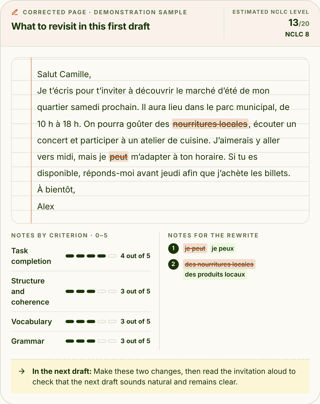
Decision 3: end with one instruction, not a report
The yellow band at the bottom of that page is the part I would defend hardest. Everything above it is diagnosis; a candidate with a booked date needs a prescription.
It says what to change and what to do afterwards (make these two changes, then read it aloud), and it is deliberately singular. A report with nine recommendations produces zero attempts. One instruction produces a second draft, and the second draft is the entire product.
- 1
Write
One task, in exam format, with the word range and structure visible.
- 2
Submit
The attempt is stored so the next one has something to compare against.
- 3
Read the page
Four scores, errors marked in place, ranked by severity.
- 4
Do one thing
A single instruction for the next draft.
Writing should feel like the exam, not like a text box
The practice surface is the other half of the interface. It shows the prompt, the word range, and the recommended TCF structure for that task, because a candidate who does not know an article needs a headline loses marks on recevabilité before writing a word.
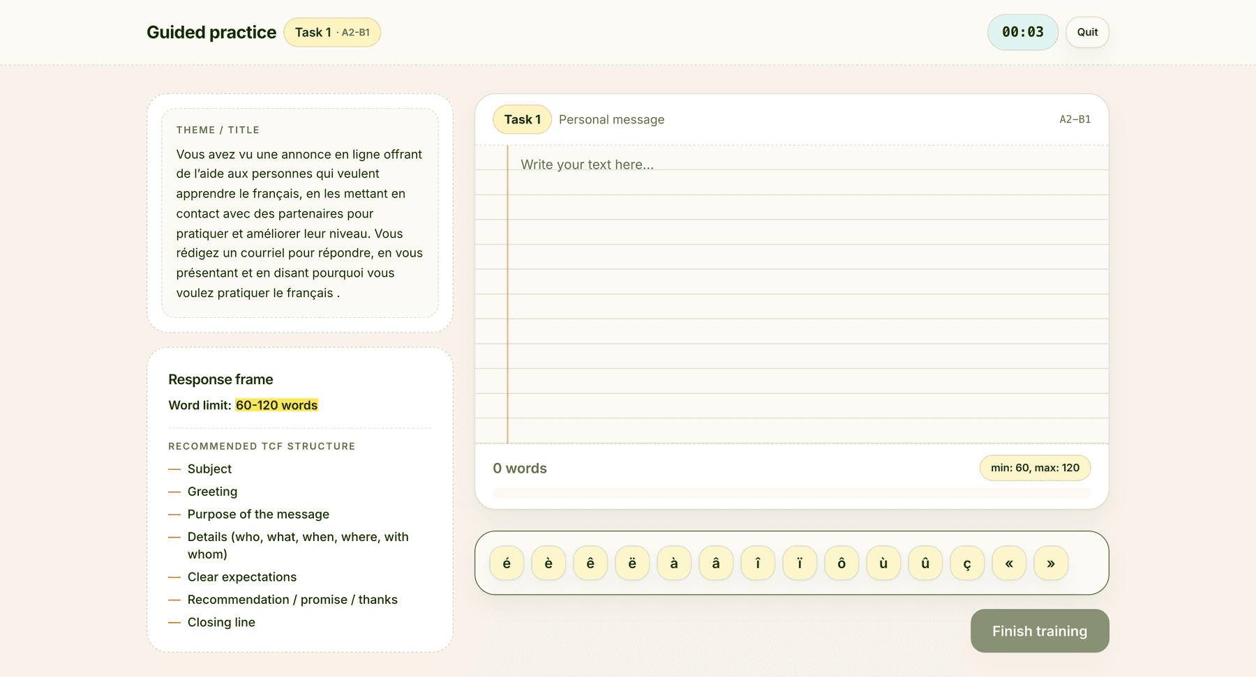
Two details there came from watching people practise rather than from a spec: the word counter shows the range, not a target, because both ends are scored; and the accented-character keys sit under the text area because typing "é" on a Canadian English keyboard is a real interruption when you have fifteen minutes.
Guest-first: write before you sign up
Exam-prep products die at the signup wall. Candidates arrive anxious and unwilling to trade an email for an unknown. So the funnel opens with a complete Tâche 1: a real prompt, a real timer, real model feedback, and no account.
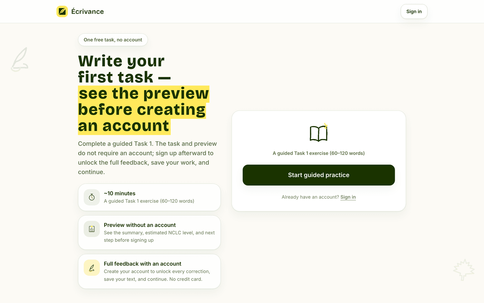
The interface was the easy half. The consequence was structural: the session's user reference had to become nullable, a guest is identified by a device ID held in local storage, and the authentication callback silently claims that guest's work into the new account. Nothing the learner wrote is lost at the moment they sign up, which is the only reason the wall can be moved this late.
Two shells, two payment rails
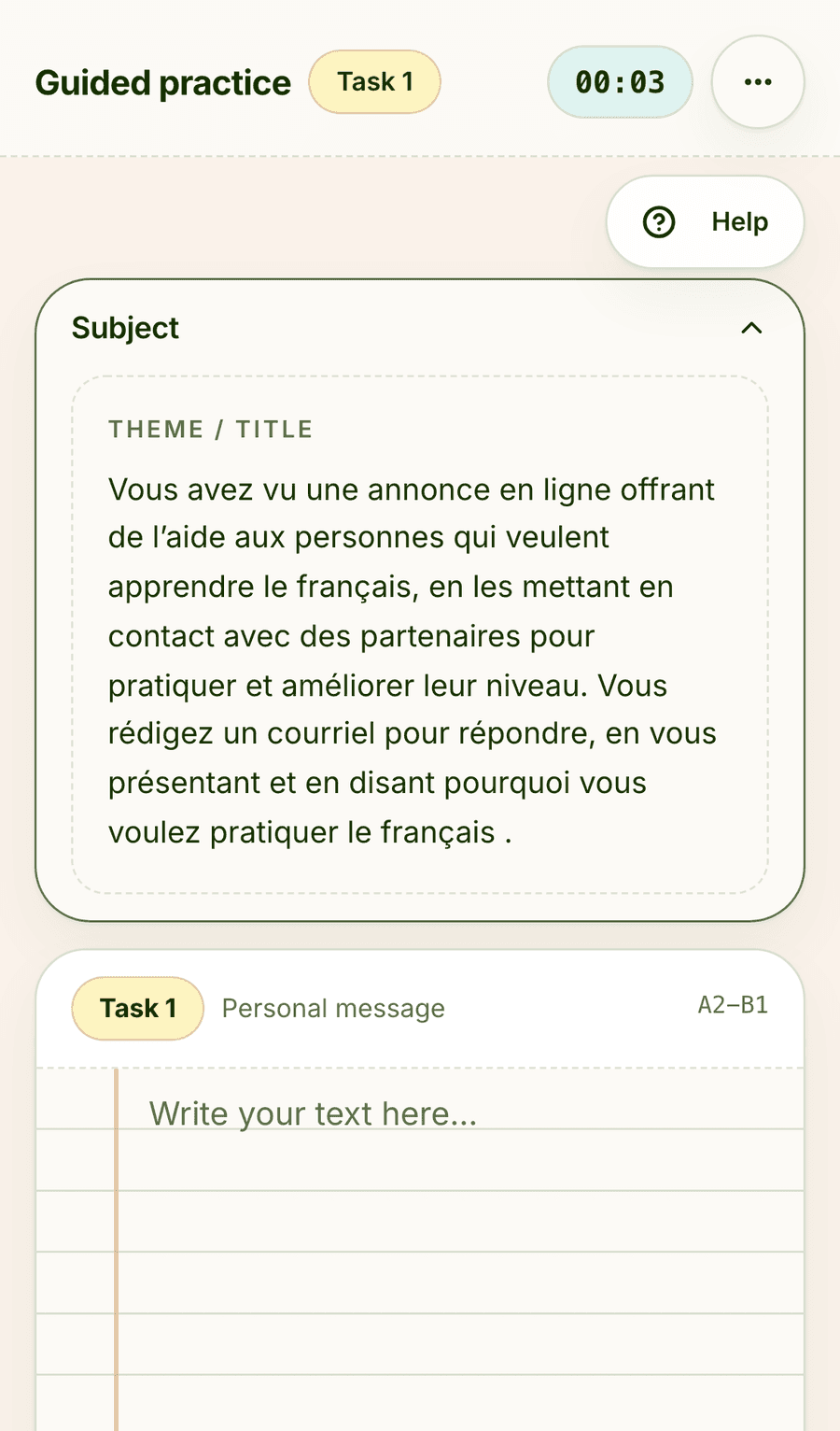
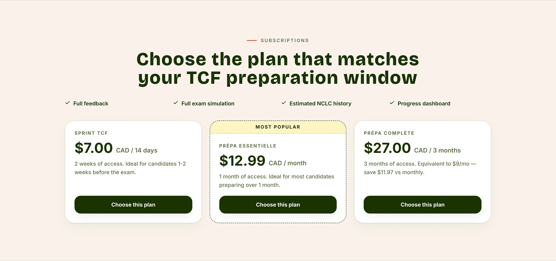
The mobile app is not a wrapper. It shares the authentication, the feedback pipeline, and the theme library, and diverges exactly where the platforms force it to: web billing runs through Stripe, mobile through in-app purchase, which is why only the monthly and annual plans are exposed on iOS and Android. Drafts persist locally so a task started on a commute survives to Wi-Fi.
What the instrumentation is for
The product carries 36 named events across the landing page, the guest funnel, the dashboard, onboarding, the guided path, and the support widget. Two of them exist purely to keep me honest about the feedback itself: feedback_rated and feedback_disputed. If the interface is convincing but the grading is wrong, a dispute rate is the only thing that will tell me before a customer does.
This is the same measurement habit as the Hand Talk analytics framework, applied to a product where I own both the instrument and the thing being measured.
Where it stands
293,849
words of French written and corrected through the product
2,336
texts submitted and scored against the four criteria
28m 29s
average engagement per active user
Two of those are counters the product publishes on its own home page. The third is the one I care about most: nearly half an hour of engagement per active user is not a number a novelty produces. People are writing, reading the page, and writing again.
On the commercial side, 101 customers have paid for a subscription and 23 are active, on plans between CA$7 and CA$27. Usage is concentrated where the thesis said it would be: Vancouver, Toronto and Montreal are the top three cities, which is what a product for a Canadian immigration exam should look like.
What I do not have yet is the number that matters most: whether score improves across attempts for the same person. The data to compute it exists in the attempt history. I have not held it against a large enough cohort to claim anything, so I am not claiming it.
Learner zero
I sat the TCF Canada while building this, and used the product to prepare.
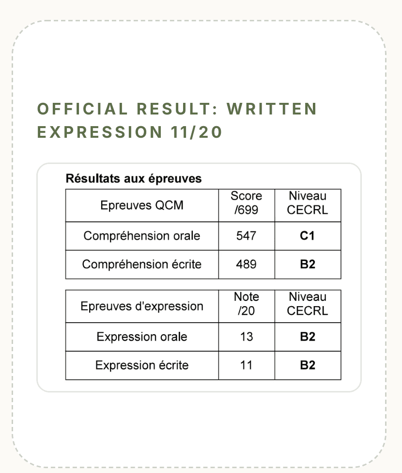
It is on the marketing site too, unedited. An 11/20 is a mediocre score to publish next to a product that grades writing, and publishing it is the point: the tool was built by someone who needed it, not by someone demonstrating that he did not.
Three visual systems in nine months
The product shipped as BonMot TCF in a pastel neobrutalist system: flat accents, hard black borders, heavy offset shadows. It was distinctive and it was wrong: it read as a casual consumer app for something that gates an immigration file.
The second system corrected too far into navy editorial seriousness. The third is the one running now, called Le Cahier, a notebook: cream paper, forest-green ink, a red margin rule, marker washes for correction.
BonMot · pastel neobrutalism
- Six flat pastel accents, used decoratively
- 3px black borders, hard offset shadows
- Colour carried no meaning
- Reads: playful consumer app
Écrivance · Le Cahier
- Ink
#1a3300carries all structure: text, buttons, borders - Dashed hairlines, soft elevation, cream grounds
- Marker colours are bound to severity and nothing else
- Reads: a workbook you are allowed to write in
The third system is the first one where the visual language and the product's job agree. Correction marks were already the most important thing on the screen; a notebook is simply the honest container for them. Character is measured rather than uniform: full notebook texture on the landing page, results and writing screens; calm cream and ink on settings and admin, where personality is noise.
Lessons learned
Constrain the model, then design the certainty. The four-criteria schema is what makes the page tight. When I let the model choose its own shape, every screen had to defend against prose of unknown length, and every screen was worse for it.
Colour alone was a bug, not a polish item. Marking minor errors in green was a small styling choice that inverted the meaning of the page. Severity needed shape as well as hue, the same rule I had already validated on an accessibility product, arriving here the hard way.
One instruction beats nine recommendations. The feedback page got more useful when I stopped trying to be complete and started ranking. Completeness was flattering to the model and useless to the learner.
Rebranding twice was expensive and correct. The first identity was designed for a product I found fun to build, not for one that sits in an immigration file. Voice is not decoration when the thing you are selling is judgement.
Being the user is a shortcut with a cost. It made discovery fast and the first version sharp. It also let me skip structured interviews with paying users for far too long, and that is the gap I would close first.
Other projects.

Hand Talk · Q4 2022
Why 94% of Our Leads Were Wrong
A UX investigation into disqualified leads revealed an unexpected behaviour pattern, and one redirect fixed everything.
94% → 0% disqualified leads from the plugin loading screen
- UX Research
- Behavioral Analysis
- Optimization

Hand Talk · May – July 2022
Translation Evaluation Impact Analysis
Measuring what an accessibility-led redesign of Hand Talk's evaluation screen actually changed. Evaluations rose 93.30%, and they rose while the audience shrank.
+93.30% increase in completed translation evaluations
- UX Research
- Accessibility
- Data Analysis

Hand Talk · Q3 2023
Accessibility Benchmarking for Product Roadmapping
Mapping 43 features across five competitors and prioritizing what truly matters for users and compliance.
43 features benchmarked into a 7-feature 2024 roadmap
- UX Research
- Accessibility
- Benchmarking

Hand Talk · 2022–2023
Making an Accessibility Product Measurable
Mapping 11 flows and 53 trackable states for an accessibility plugin, and building the measurement layer every later study here runs on.
11 flows mapped into 53 trackable interactions and states
- Product Analytics
- Measurement Design
- User Flows