TL;DR
I led the analytics measurement of Hand Talk's redesigned translation evaluation interface, discovering a 93% increase in user engagement and 11% improvement in translation ratings through comprehensive behavioral data analysis.
Impact:
93% increase in translation evaluations
11% improvement in average translation ratings
Enhanced data collection for ML model improvement
Validated accessibility-focused design decision
Company
Hand Talk
Date
Q1 2023
Scope of work
UX Research
Accessibility
Data Analysis

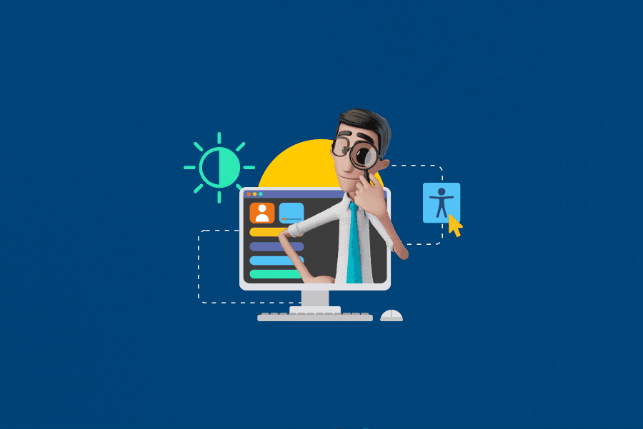
About hand talk
Hand Talk is an award-winning accessibility platform that uses AI to translate digital content into sign language through virtual avatars.
Hand Talk was acquired by Sorenson, which is a global language services provider and the leader in communication solutions for the Deaf and hard-of-hearing communities.
Context & Challenge
Our team implemented a major redesign of the translation evaluation interface, focusing on accessibility and universal design principles. The previous interface relied heavily on iconography without textual context, potentially creating barriers for users with different cognitive and visual abilities.
User Journey to Evaluation
The evaluation screen appears at a critical moment in the user journey:
User visits a website with Hand Talk plugin.
Selects text they want translated
Hugo (the 3D avatar) performs the sign language translation
Evaluation prompt appears - this is where users rate the translation quality
This evaluation is crucial for improving the AI translation model, but the old interface created friction that prevented many users from completing it.

Flowchart demonstrating the main touchpoints a user goes through until reaching the translation evaluation phase.
The Interface
Evaluation Screen Components (Old Version):
No text labels on action buttons
Gray-scale only - selected state just darkened slightly
Ambiguous feedback - users unsure if action was complete
Generic iconography without contextual meaning

Redesign Features
Meaningful colors: Green for positive, Red for negative
Added text labels: (Good) / (Poor)
Underline indicator on selected state - critical for colorblind users who can't distinguish red/green
Clear visual hierarchy showing active selection
Full button from design system with clear (Confirm) text
Check icon retained as supporting element
Obvious call-to-action that requires interaction
Eliminated confusion about submission status

Users no longer need to interpret icon meaning or rely solely on color to understand their selection.
Methodology
I designed a comprehensive pre/post implementation comparison using controlled timeframes to isolate the impact of design changes.
Timing Strategy
Before: May 8 - June 7, 2022 (30 days)
After: June 9 - July 9, 2022 (30 days)
Buffer period: June 8-9 for implementation rollout
Key Metrics Selected
Volume metrics: Total evaluation events, unique evaluation events
Quality metrics: Average translation ratings (0-1 scale)
Behavioral metrics: Session patterns, user journey analysis
Engagement metrics: Evaluation completion rates
Key Findings

Translation Evaluations Increased by 93.30%
Before: 597 total evaluations
After: 1,154 total evaluations
Net increase: +557 additional evaluations
Quality Impact
Average Translation Ratings Improved by 10.95%
Before: 0.82 average rating
After: 0.91 average rating
Improvement: +0.09 points on 1.0 scale
This suggests not only more users were engaging, but they were having better experiences with the translations.
User Engagement Patterns
Unique vs. Total Events Analysis:
1,107 total events vs. 943 unique events (by session)
Ratio: 1.17 evaluations per engaged session
Insight: Users who start evaluating tend to evaluate multiple translations in the same session
User Behavior Insights
Session-Based Evaluation Patterns
Through session sequence analysis, I discovered when users are most likely to evaluate translations:
First Session Dominance:
73.31% of evaluations (846 events) occur in users' first session
14.82% occur in the second session (171 events)
11.87% occur in sessions 3-105 (137 events)
Key Behavioral Insight: The majority of evaluation behavior happens immediately when users first encounter the feature, making first-impression usability critical.
Business Impact
User Engagement: Nearly doubled the rate of translation evaluations
Data Quality: 11% improvement in average ratings provides higher-quality training data
Product Intelligence: Increased feedback volume gives ML teams more data for model improvements
Accessibility Success: Demonstrated that universal design principles drive measurable business outcomes
Lessons Learned
This analysis reinforced that accessibility isn't just the right thing to do, it's good business. By making the evaluation interface more inclusive and contextually clear, we didn't just help users with disabilities; we improved the experience for everyone, resulting in nearly double the engagement.
Most importantly, this project demonstrated the critical value of measuring design impact. Without proper analytics, these improvements might have been overlooked or undervalued. Data transforms design decisions from subjective preferences into strategic business investments.